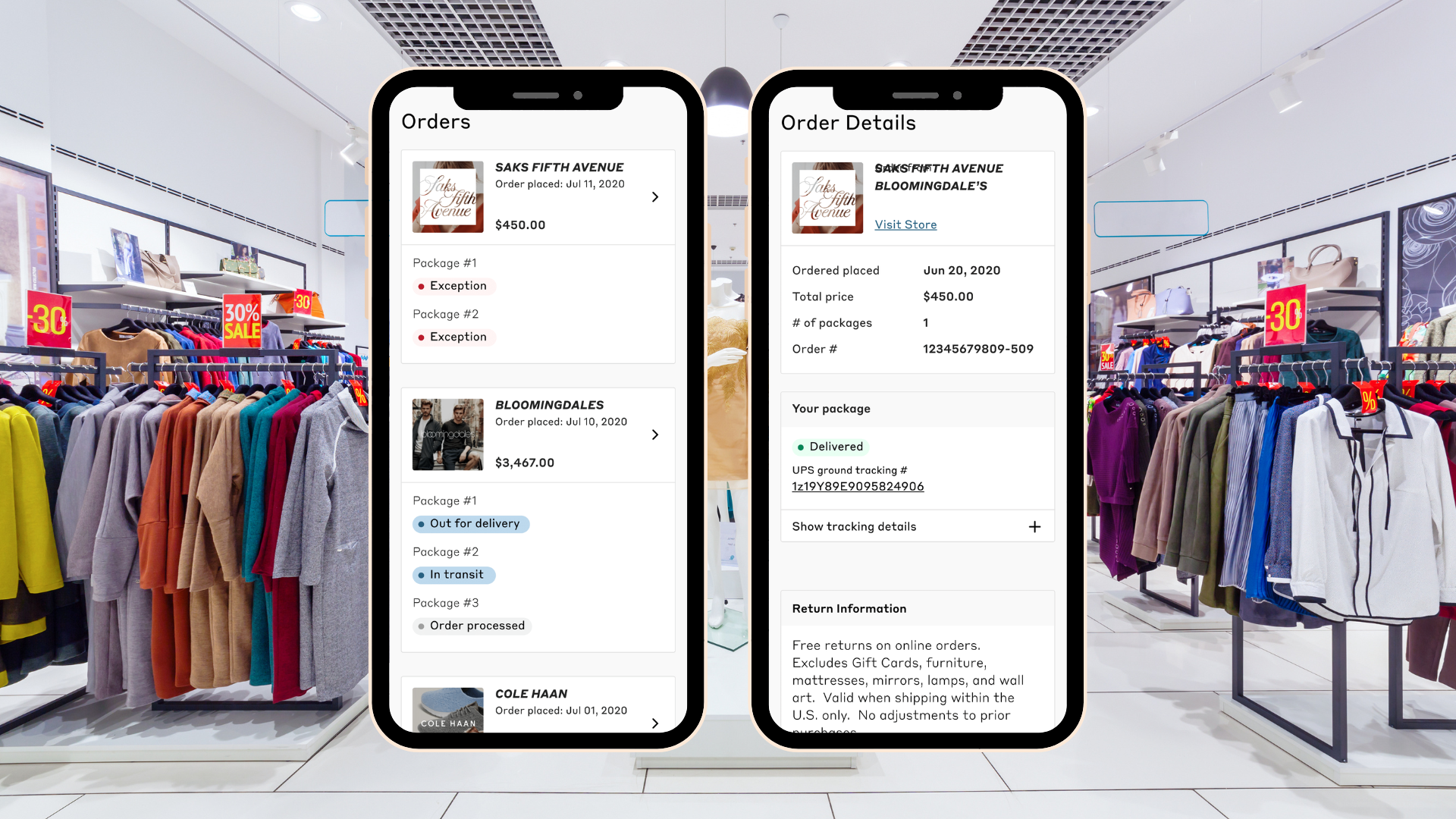
Orders and Returns

Overview
ShopRunner is a subscription-based company that gives users access to a wide range of products within its network, offering benefits like free 2-day shipping and free returns. During the COVID pandemic, the company shifted focus from new business outreach to enhancing its core offerings—orders and returns. These areas had not received significant updates for some time and had been somewhat neglected over the years.
My Role
Collaborated closely with Product Managers to define the key business requirements for this project.
Conducted thorough internal and external research prior to starting the design process.
Developed mockups for A/B testing and for seamless handoff to the development team.
Identified an MVP approach to address the most critical user needs effectively.
Engaged with developers daily to ensure a smooth and accurate handoff process.\
Collected insights from the initial MVP implementation to assess outcomes and refine the approach.
Worked with the Core team to establish the next steps for the project’s progression.
Discovery and Research
To design an improved experience for placing and returning orders, I collaborated closely with product and business teams to understand our users' needs. Before diving into design, I conducted extensive research to identify specific user pain points and opportunities for improvement.
Experience Audit: I documented the core user flow, revealing gaps in the Returns process. Notably, users lacked a dedicated Returns Details page that outlined the steps for returning an item.
Internal Research: I reviewed prior interviews and research conducted by our team on Orders and Returns. A recurring theme was the need for an order number connected to the delivery service (e.g., UPS), allowing users to track their shipments more easily.
Competitive Analysis: I examined the return processes of other e-commerce platforms like Etsy, Shop, and Wayfair. These companies provided clear tracking indicators, a feature our process lacked.
Information Architecture: I mapped out the current experience to identify gaps in information provided to users. I found that users could not easily determine which items they needed to return within an order.
Articles and Online Research: I reviewed articles from resources like Smashing Magazine and Nielsen Norman. One key finding was the importance of clear language regarding delivery and return timelines, which our design lacked.
Metrics and Data Analysis: I examined our Google Analytics data, identifying a 65% drop-off rate during the return label printing stage—a clear indication of friction in the returns flow.
User Interviews: I collaborated with call center representatives to identify users who had encountered issues with our return process. These interviews revealed that inconsistent communication and a lack of timing information for orders and returns severely impacted the user experience.
MVP Designs
Working closely with product managers, we outlined designs aligned with the MVP approach for this project. We used a priority matrix to assess and rank each idea, guiding our decisions on key design elements.
Consistency and Seamlessness: The previous design lacked consistency across the design system and between pages, resulting in a disjointed user experience. We ensured that each page felt cohesive and part of the same flow, enhancing the overall user journey.
Enhanced Store Information: We added clearer and more detailed store order information across multiple pages, significantly improving clarity and usability compared to the previous version.
Updated Tracking: We incorporated tracking information on the orders and returns pages, including links to courier details. This addition addressed major user concerns around tracking and provided a smoother experience.
Return Label Process Improvement: We streamlined the return label printing process to reduce user drop-off at this stage, addressing a significant pain point in the return flow.
Clarity in Processes: Each page was refined to improve clarity around order and return processes, particularly in the context of ShopRunner's partner interactions.
Return Progress Pages: We introduced progress pages within the return process to clearly indicate where users were within the return flow, improving transparency and ease of use.
Additionally, we designed with future iterations in mind. For example, while users couldn’t select specific items for return within the MVP timeframe, we prepared the return page to support this feature in later releases.
Testing Plan
Following an MVP approach, I met with users to assess whether their concerns were addressed. The testing process included:
User Testing: Using Validately, we guided 10 users through a step-by-step walkthrough of the Order and Return flows. Seven out of ten participants highlighted tracking information as the most valuable data point in the process.
A/B Testing: I created three design versions and tested each with five users. Breaking down the return flow and clearly defining courier information proved to be the most effective, helping users complete the flow with greater confidence.
Results
The release of this project helped reduce customer drop-off in the return flow from 65% to 45%. Additionally, call center inquiries regarding the return flow decreased from 30% to 27% of total calls.
Shortly after the Orders and Returns flow was enhanced, ShopRunner leveraged these improvements when negotiating its acquisition by FedEx. While many factors contributed to the acquisition, this project underscored the effectiveness of our post-purchase experience.


